Barrier Reef AquariumSouth Florida's Premier Aquarium Store
Saltwater and freshwater livestock, aquarium services, custom aquarium design, and supplies.
Seen at the Reef
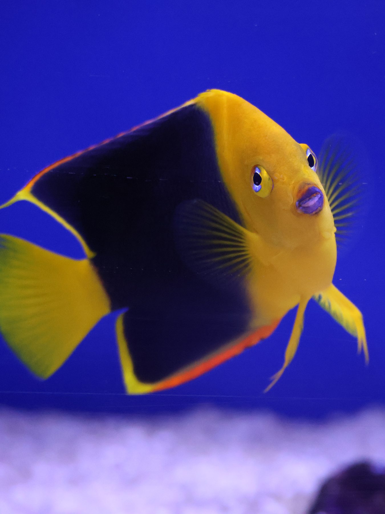
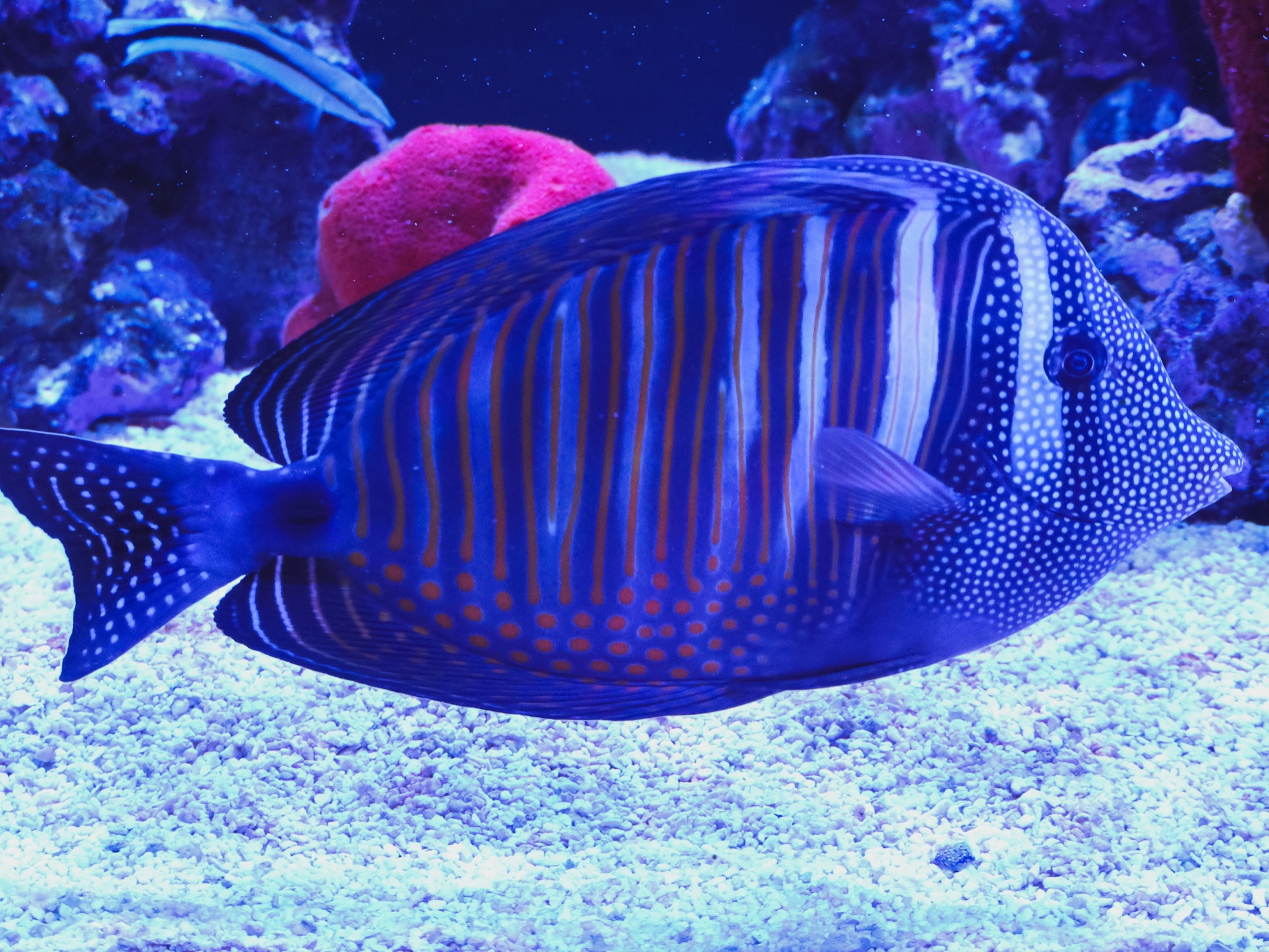
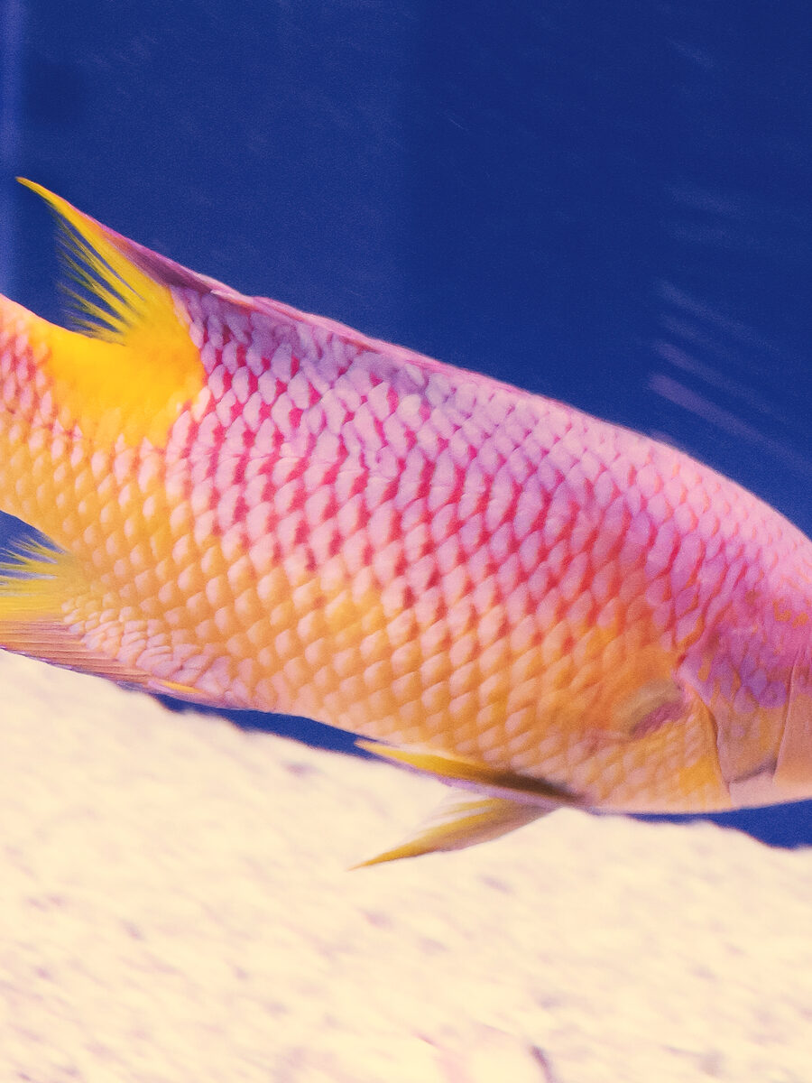
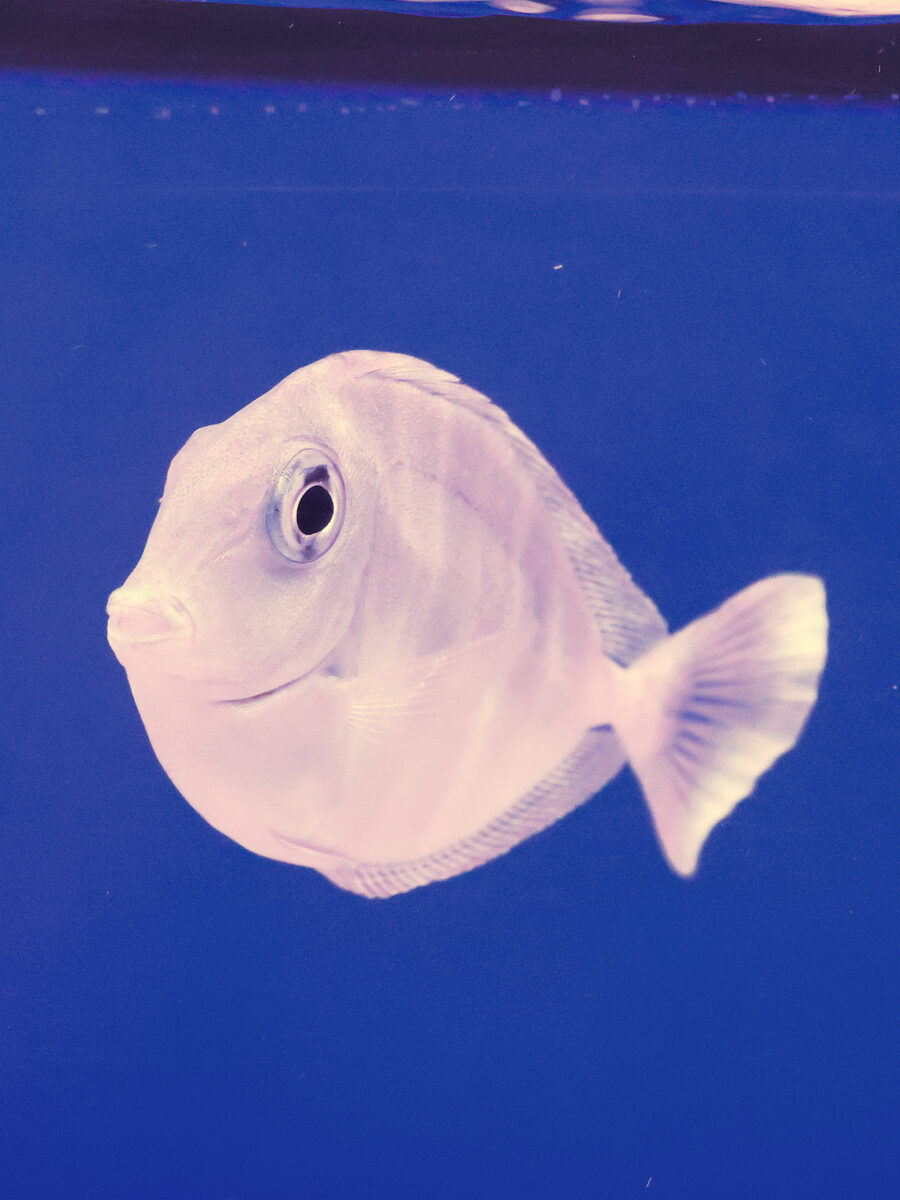
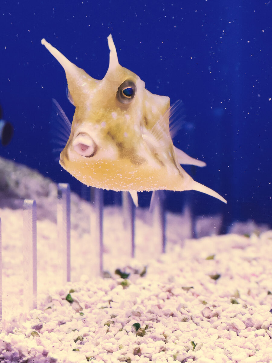
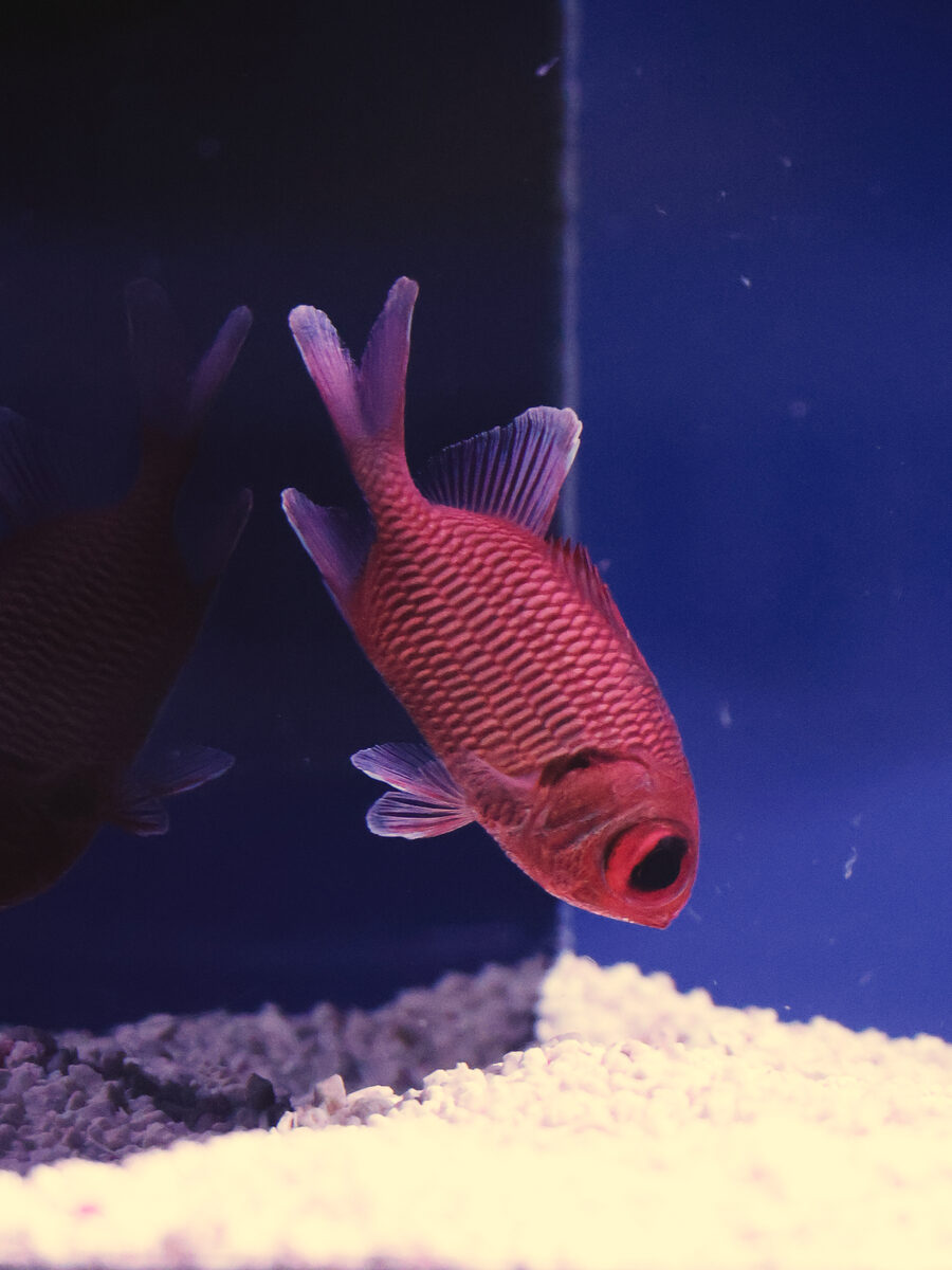
Explore a selection of freshwater and saltwater species that have made their way through Barrier Reef. Availability changes regularly, so visit us to discover what's currently in our tanks.
Every photo featured here was captured at Barrier Reef, showcasing the unique livestock that has passed through our tanks.
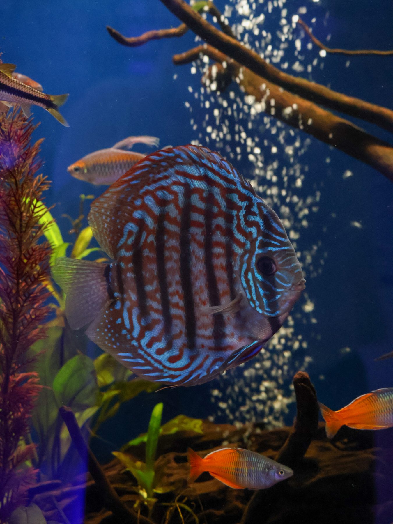
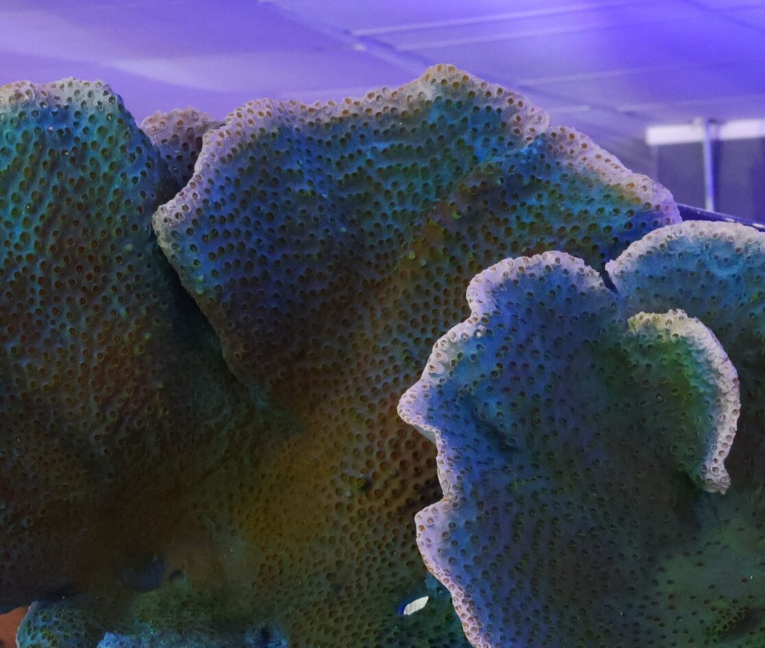
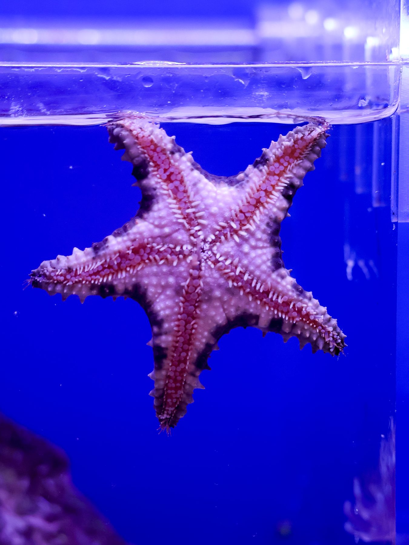
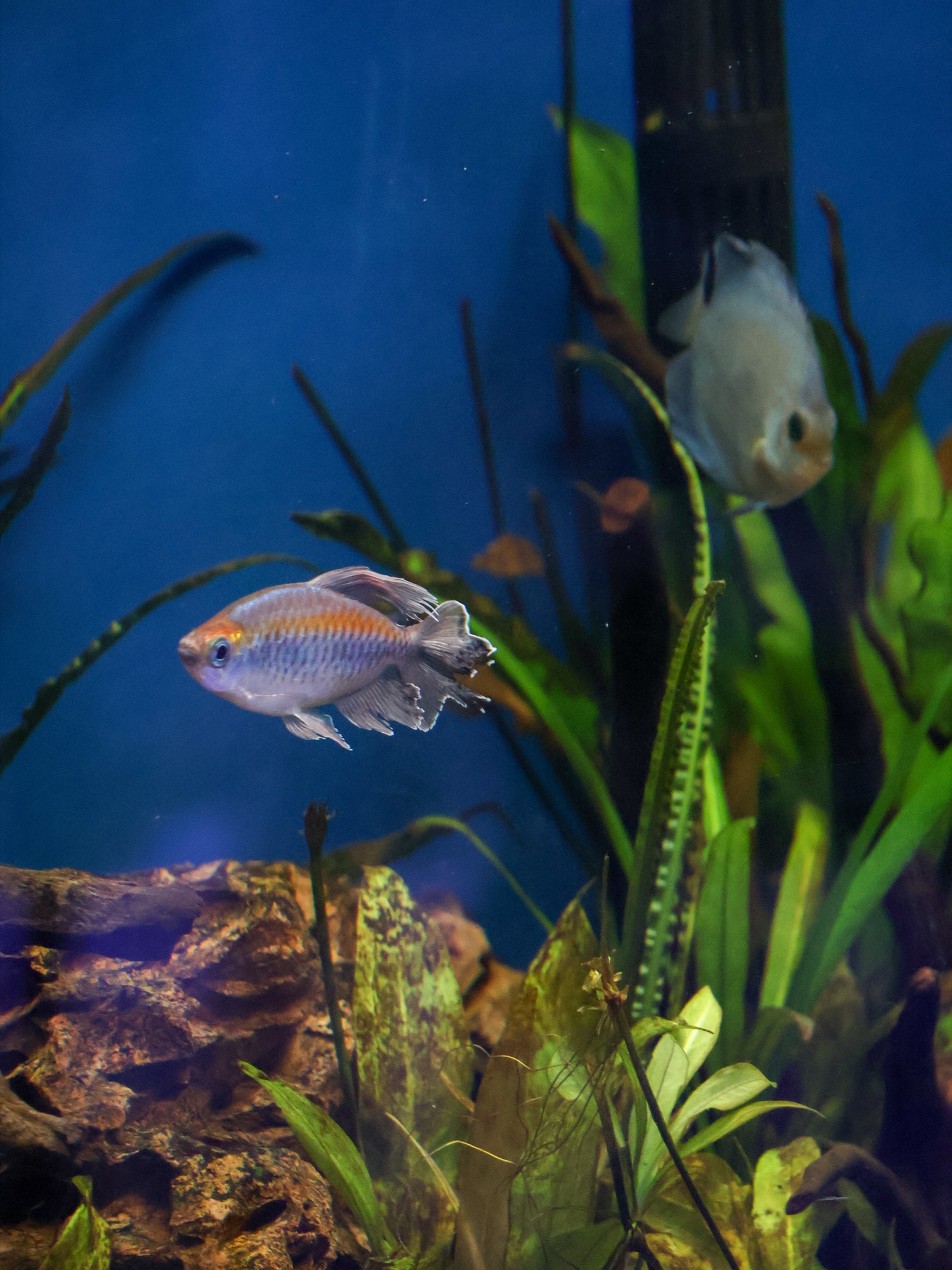
Looking for a species you don't see? Call the store or ask at the counter and we will source it.
Filtered Natural Seawater
RO/DI Water
Filtered Fresh Water
Self-service · By the gallon
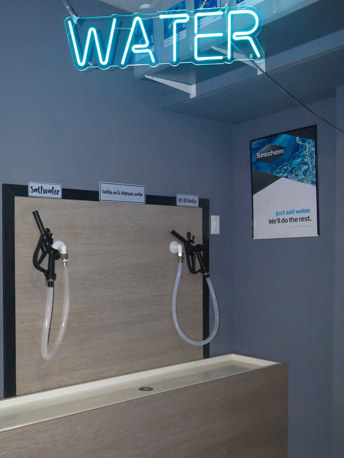
The Water Station
Self-service water by the gallon. Fill exactly what your system needs.
You can also bring in a water sample for expert testing and analysis.
More than the store.
We design, plan, install, stock, and maintain aquariums for homes and businesses.
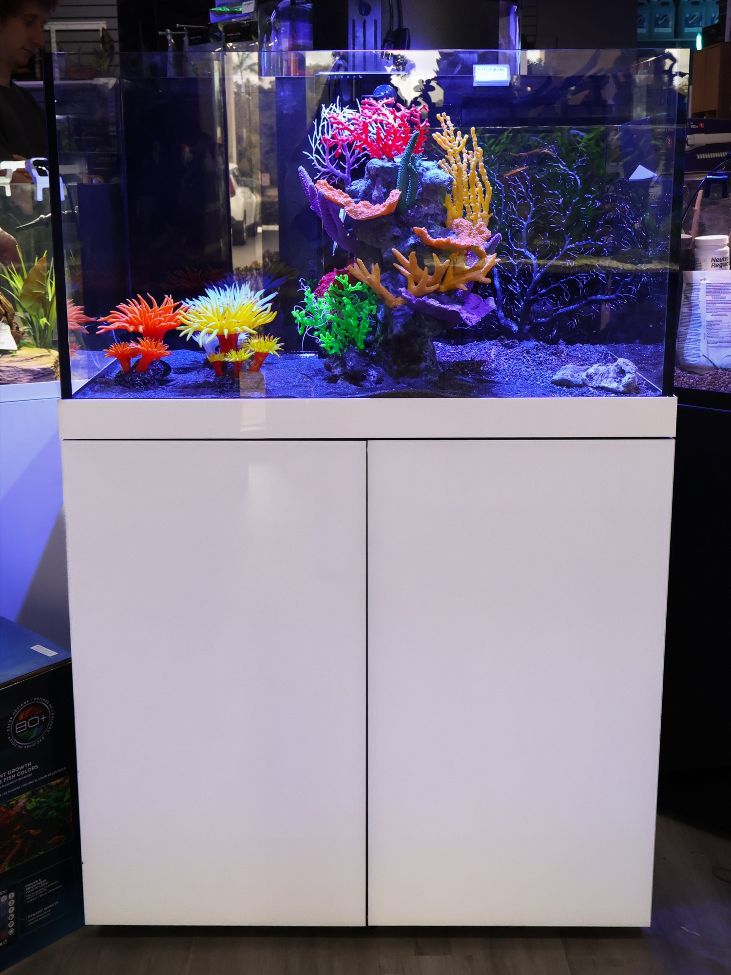
Aquarium Design + Planning· Equipment Selection· Delivery & Installation & Break Downs· Custom Aquascaping· Livestock + Stocking Plans· Aquarium Relocation· Maintenance· Expert Aquarium + Livestock Knowledge· Livestock Health Assistance· Necropsy Services
All Services →Dreaming of a custom aquarium? Let's bring it to life.
Prefer to start online?
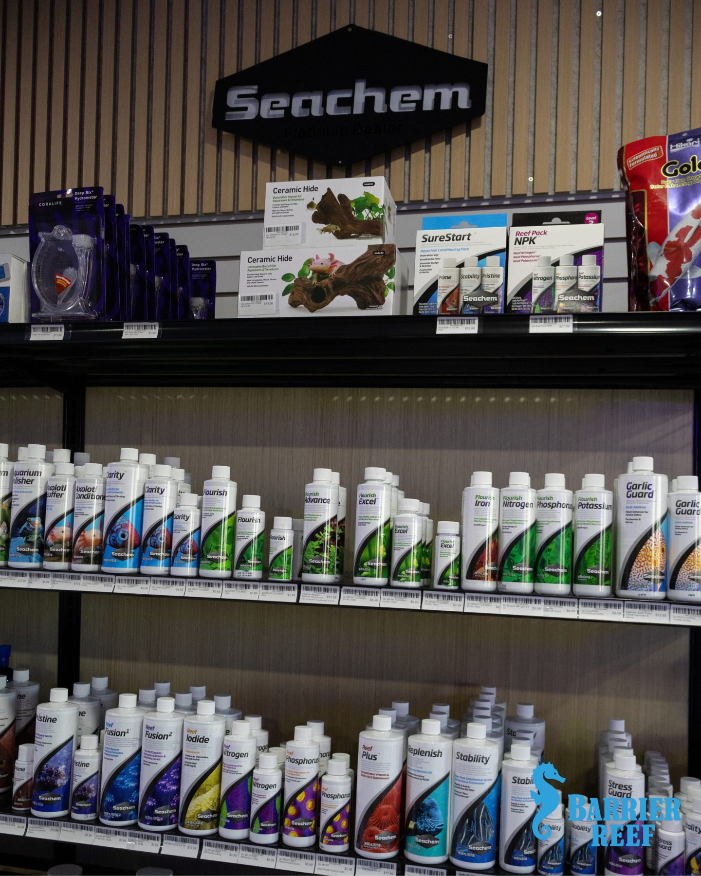
Everything your system needs.
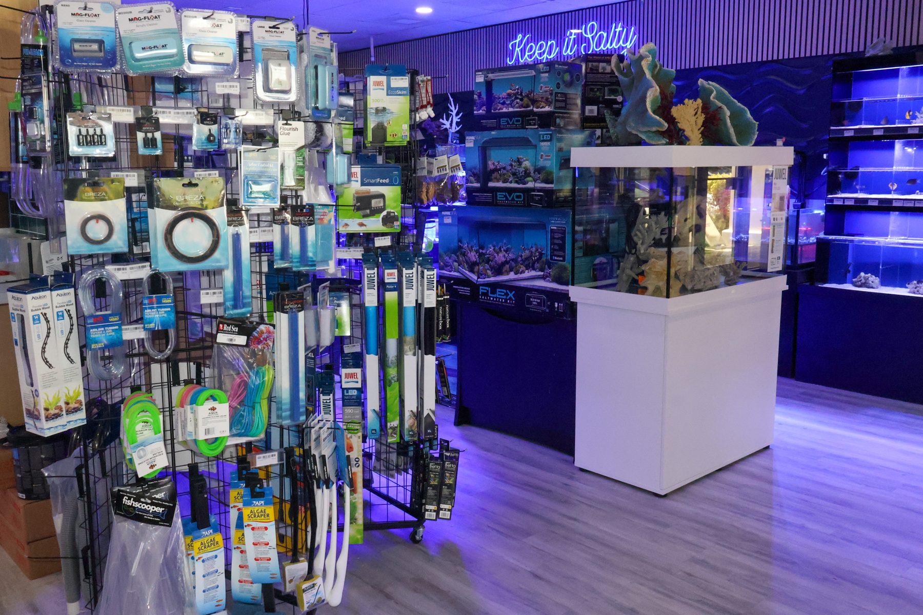
Aquariums, supplies, reef products, and the essentials, stocked on the floor from the brands reef keepers trust.
- Aquariums + Stands
- Aquarium Supplies
- Accessories
- Reef Products
- Food + Essentials














From the Tanks
New livestock, new products, and what's happening on the floor, posted from the store.
@thebarrierreefBarrier Reef Aquarium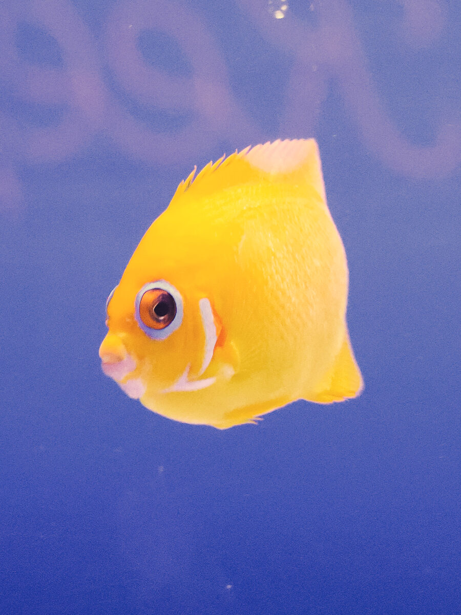
Live Instagram feed connects at launch.
What the reef community says, straight from Google.
4.4★★★★482 Google reviews · See all →Live Google reviews connect here
★★★★★
Google reviewer · x weeks ago · Posted on Google
Live Google reviews connect here
★★★★★
Google reviewer · x weeks ago · Posted on Google
Live Google reviews connect here
★★★★★
Google reviewer · x weeks ago · Posted on Google
The Reef Standard
Who we are, and the standard every animal in the store is held to.
Providing the highest standard of care for every aquatic animal.
Sharing knowledge that helps our customers build healthy, thriving aquariums.
Offering honest guidance, putting the well-being of both our customers and animals first, and supporting ethical sourcing, aquaculture, and responsible harvesting practices.
Creating a welcoming environment for hobbyists of all backgrounds, experience levels, and budgets.
Care Guides
What we know, written down and given away.
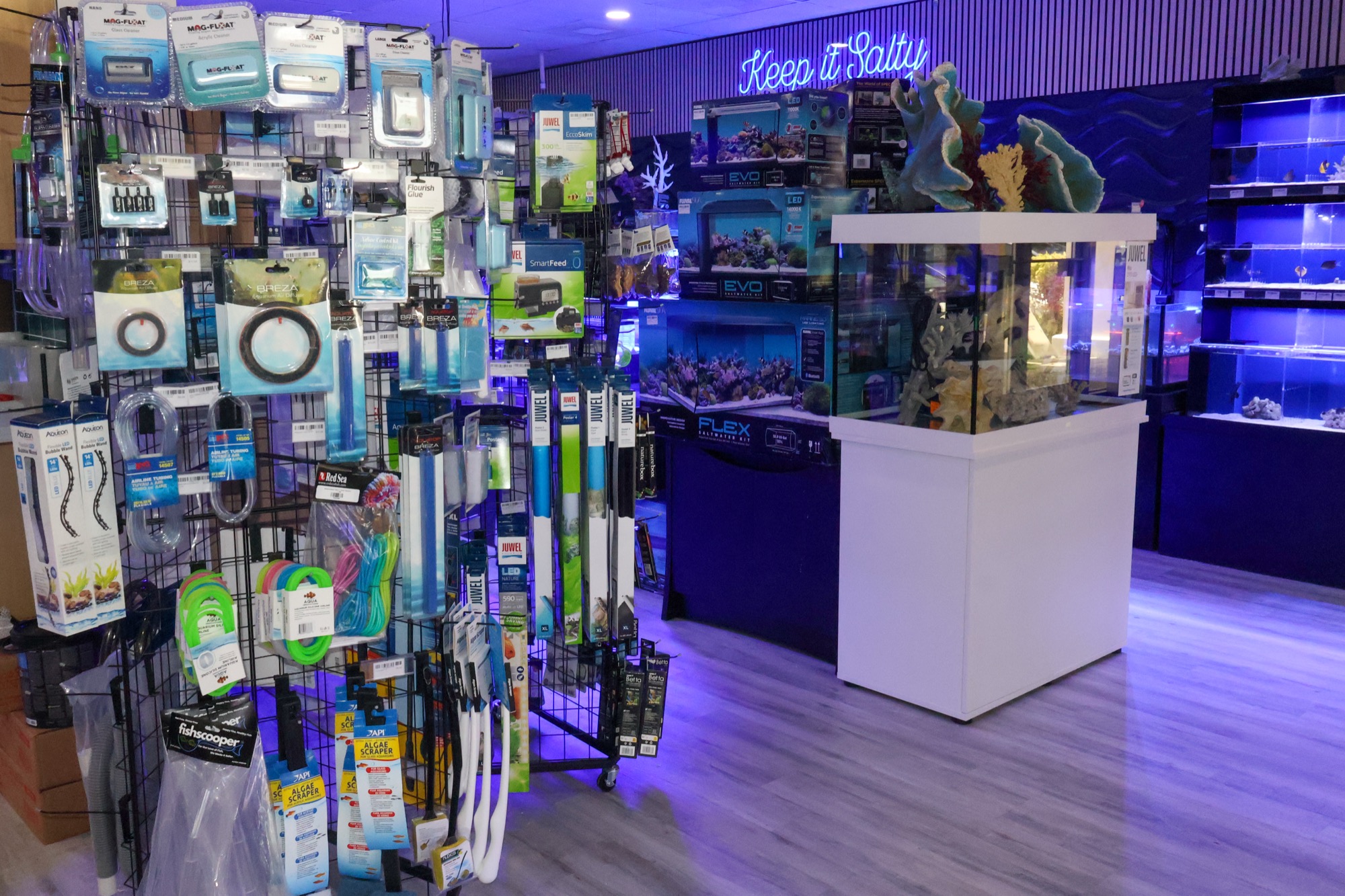
Come See the Floor
Livestock turns over constantly, so the site shows the categories and the store shows today. Filtered seawater, RO/DI, and fresh water by the gallon at the Water Station.
Monday to Saturday, 11 to 7 · Sunday, 11 to 5
1921 NW 2nd Ave, Boca Raton, FL · (561) 859-8131